


Looker Studio (formerly Google Data Studio) is a free dashboard and reporting tool by Google. It lets you turn raw data into interactive charts, graphs, and tables – all in one place. This guide will walk you through creating SEO reports in Looker Studio, from connecting your data sources to building a custom SEO dashboard. We’ll use simple, beginner-friendly language and clear steps. Whether you’re new to Looker Studio or an SEO professional looking to streamline reporting, this tutorial has you covered.
1. Introduction to Looker Studio and Why It’s Useful for SEO
Looker Studio is a powerful reporting platform for digital marketing and SEO. It allows you to combine data from multiple sources (like Google Analytics, Google Search Console, etc.) into a single dashboard. For SEO, this means you can view your search performance and website analytics side by side. Here are a few reasons Looker Studio is great for SEO reporting:
- Centralized Data – You can pull in data from Google Search Console, Google Analytics, and other SEO tools into one report. This gives a comprehensive view of your SEO metrics without needing to switch between platforms
- Real-Time & Interactive – Reports update with fresh data (e.g., daily). You can interact with filters and date ranges to explore the data dynamically.
- Customization – Create visualizations (charts, graphs) and arrange them as you like. You can apply your brand’s colors, add logos, and tailor the layout to your needs .This helps in making reports client-friendly and on-brand.
- Sharing & Collaboration – Easily share dashboards with team members or clients via a link. Multiple people can view (or edit, if allowed) the live report, ensuring everyone sees up-to-date metrics.
In short, Looker Studio helps transform complex SEO data into an easy-to-understand dashboard, which saves time and improves insights for decision-making.
2. Connecting Google Search Console and Google Analytics to Looker Studio
Before building the SEO report, you need to connect your data sources. The two primary data sources for SEO are Google Search Console (GSC) and Google Analytics (GA) (specifically GA4, the latest version of Google Analytics). Below are step-by-step instructions for connecting each of these to Looker Studio. This setup only needs to be done once per report.
Connecting Google Search Console in Looker Studio
1. Sign in to Looker Studio: Go to lookerstudio.google.com and log in with the Google account that has access to your Search Console data.
2. Start adding a data source: On the Looker Studio home page, click the big “Create” button (usually a plus sign) and select “Data Source.”
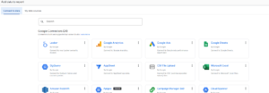
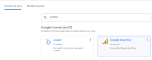
3. Select the Search Console connector: You’ll see a list of connectors (Google connectors, partner connectors, etc.). Click on “Google Search Console” from the list
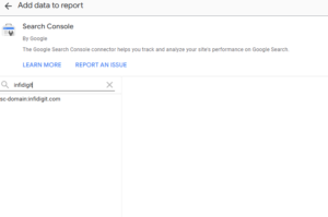
4. Authorize access: If prompted, click “Authorize” to grant Looker Studio permission to access your Search Console data. Make sure you use the same Google account that has access to your Search Console property.
5. Choose your website property: After authorization, you’ll see a list of Search Console sites you manage. Select the website property you want to use for the report
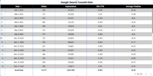
6. Select the data table: Search Console provides two main data sets – Site Impression and URL Impression. For an SEO overview, choose “Site Impression”, which contains metrics like clicks, impressions, CTR, and average position (Leveraging Looker Studio for Enhanced SEO Reporting and Analysis.docx). (Use “URL Impression” if you need page-level breakdowns.)
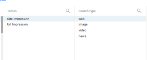
7. Choose default Search Type: Optionally, you can pick a default search type (Web, Image, Video, News) or leave it as “Web” for general web search data
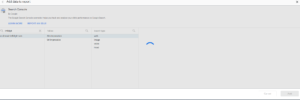
8. Connect the data: Click the “CONNECT” button (usually at the top right) to finish connecting the Search Console data source. You’ll see a schema of the fields available once connected. Finally, click “Add to Report” to add this data source to your new report
That’s it! Your Search Console data (such as impressions, clicks, etc.) is now connected and ready to use in Looker Studio.
Connecting Google Analytics (GA4) in Looker Studio
1. Create a new data source (GA4): Similar to above, click “Create” → “Data Source” from the Looker Studio home page.
2. Select the Google Analytics connector: From the list of connectors, choose “Google Analytics”. This connector supports GA4 properties
3. Authorize if needed: If it’s your first time using the GA connector, authorize Looker Studio to access your Google Analytics account.
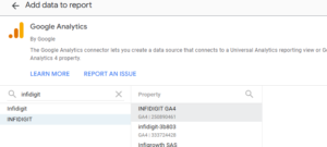
4. Select your GA4 property: Choose the Google Analytics account and then the specific GA4 property for your website. (If you have multiple properties, pick the one you use for your site’s analytics. You don’t need to select a “view” for GA4 – GA4 properties don’t have multiple views like Universal Analytics did.)
5. Connect the data: Click “CONNECT” to link Looker Studio with that GA4 property’s data . After connecting, you might see the list of fields (metrics and dimensions) from GA4. Then click “Add to Report” to add it to your report.
Now you have both Search Console and Google Analytics data sources added to your Looker Studio report. In the report editor, you can confirm this by looking at the Resource > Manage added data sources menu, where both GSC and GA4 should be listed. With these connections set up, you’re ready to start building your SEO dashboard.
Pro Tip: You can connect many other sources too. Looker Studio has connectors for databases, Google Ads, YouTube, and third-party SEO tools. For example, you could use partner connectors (like Supermetrics or others) to pull data from Bing Webmaster Tools, SEO software, etc., if needed (Leveraging Looker Studio for Enhanced SEO Reporting and Analysis.docx). But for most SEO reporting, Google Search Console and Google Analytics provide the essential data without additional fees.
3. Essential SEO Metrics and Dimensions to Track
Once your data sources are connected, it’s important to decide which SEO metrics and dimensions to include in your report. Focusing on the right metrics will help you and your stakeholders understand SEO performance at a glance. Below is an overview of key Search Console and Google Analytics metrics/dimensions that are commonly used in SEO dashboards:
- Impressions (Search Console): The number of times your website appeared in Google search results (even if not clicked). A high impression count means your site is showing up often, indicating visibility for various searches.
- Clicks (Search Console): The number of clicks from search results to your site. This represents how much traffic you actually got from Google’s organic results.
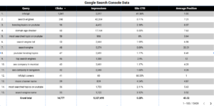
- Click-Through Rate (CTR) (Search Console): The percentage of impressions that resulted in a click. CTR = (Clicks / Impressions) × 100%. This tells you how effective your search snippets are at getting users to click . For example, a low CTR may mean your title or meta description could be improved to attract clicks.
- Average Position (Search Console): The average ranking of your site for the queries it appeared for. For instance, an average position of 5 means on average you are the 5th result. This metric indicates how high you typically rank in search results (lower number is better, with #1 being top).
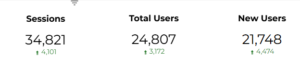
- Organic Sessions (Google Analytics): The number of visits to your site that came via organic search. In GA4, you might use the metric “Sessions” filtered to the source/medium of google/organic. This shows overall SEO-driven traffic volume.
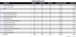
- Users (Google Analytics): The count of unique visitors from organic search. This helps to know how many individuals are coming through SEO (as sessions can count multiple visits by the same person).
- Bounce Rate (Google Analytics): The percentage of visitors who left after viewing only one page. A high bounce rate from organic traffic can signal that visitors didn’t find what they expected or needed on the landing page. (In GA4, “bounce rate” is available as the inverse of “engagement rate”.) This metric helps assess landing page relevance for SEO visitors.
- Average Engagement Time (or formerly Avg. Session Duration in Universal Analytics): How long organic visitors stay on your site on average. This indicates engagement quality. (GA4 uses engagement time since bounce rate is defined differently.)
- Goal Completions / Conversions (Google Analytics): The number of desired actions completed by organic visitors, such as form submissions, purchases, etc. If you have set up conversions in GA4 (or goals in UA), tracking how many were driven by organic search is crucial to tie SEO to business outcomes.
- Top Queries (Search Console dimension): The search queries (keywords) that users typed into Google where your site appeared (Leveraging Looker Studio for Enhanced SEO Reporting and Analysis.docx). This dimension, when paired with the metrics above, shows which keywords bring in impressions and clicks. It’s useful for understanding user intent and which keywords drive traffic.
- Top Pages (Search Console or Analytics dimension): The specific pages/URLs on your site that are getting traffic. In Search Console, the “Pages” dimension with clicks/impressions shows which pages show up and get clicks in search (Leveraging Looker Studio for Enhanced SEO Reporting and Analysis.docx). In Analytics, the “Landing Page” dimension for organic sessions shows which pages people enter on. Tracking top-performing pages helps identify successful content.
- Country and Device (Search Console dimensions): These dimensions let you break down impressions and clicks by country and by device type (Desktop, Mobile, Tablet) (Leveraging Looker Studio for Enhanced SEO Reporting and Analysis.docx). This is useful to see where your organic traffic comes from and how performance differs on mobile vs desktop, for example.
- Source/Medium (Analytics dimension): This dimension identifies the traffic source. When filtered to “google/organic”, it isolates the Google organic search traffic (Leveraging Looker Studio for Enhanced SEO Reporting and Analysis.docx). This ensures you are looking only at SEO traffic in your GA charts.
Focus on the metrics that matter to your goals. For an SEO overview report, Search Console’s click, impression, CTR, and position metrics combined with Analytics’ engagement and conversion metrics give a balanced picture of visibility and user behavior. You can always add more, but remember – keeping the dashboard clear and not too cluttered will make it more effective.
4. Building an SEO Dashboard in Looker Studio (Charts and Scorecards)
Now for the fun part – creating the SEO dashboard in Looker Studio. After connecting your data, you’ll be in the report editor where you can add charts, tables, and scorecards. Here’s how to build your SEO report step by step:
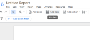
1. Create a new report: If you haven’t already, create a blank report after adding your data sources. (Looker Studio may have prompted “Add to Report” when you connected data. If not, click “Create” → “Report” and then add your data sources via the “Add data” button in the toolbar.)
2. Add Scorecards for key metrics: Scorecards are a chart type that just show a single number (metric). They’re perfect for highlighting top-level KPIs. For example, add a scorecard and set it to display Total Clicks from Search Console. Add another for Total Impressions, one for Average CTR, and one for Average Position. You can also add a scorecard for Organic Sessions (GA4) or other metrics you find important. Scorecards give an at-a-glance summary of your SEO performance
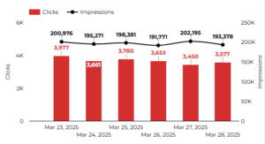
3. Add a Time Series chart for trends: Understanding trends over time is crucial. Insert a Time Series chart (a line graph) to show metrics by date. For instance, you might plot Clicks over time (by Date) from Search Console. This will produce a line chart showing how clicks fluctuate day by day (or week by week) over your chosen date range. You could do the same for impressions or even have multiple lines (e.g., one for clicks, one for impressions on the same chart). Time series charts are ideal for visualizing trends in organic traffic or impressions
4. Add a Table or Bar Chart for top queries/pages: Next, add a table or bar chart to display breakdowns of your data. A common component is a table of Top Search Queries with columns for impressions, clicks, CTR, and position. This table will list the keywords bringing traffic, sorted by clicks or impressions. Alternatively, you could use a bar chart to show, for example, the Top 10 Pages by Clicks or Top 10 Countries by Impressions. Bar charts are great for comparing values side by side (e.g., comparing clicks for your top pages) (Leveraging Looker Studio for Enhanced SEO Reporting and Analysis.docx). If you choose a table, you can sort it and show more detailed numbers. If you choose a bar chart, it gives a quick visual ranking.
5. Add a Geo Map (optional): If geographic performance is relevant to you, consider adding a Geo Map chart. A geo map can color-code countries or regions based on a metric (for example, fill countries by the number of clicks). This gives a nice visual of where your organic traffic is coming from in the world. To do this, insert a Geo chart, use “Country” as the region dimension, and “Clicks” or “Sessions” as the metric. You’ll get a world map highlighting your top countries.
6. Repeat for other visuals as needed: You might also incorporate other visualization types. Some ideas: a pie chart (donut chart) to show the percentage split of device type (mobile vs desktop clicks), or a scatter chart to explore correlation (like keywords’ positions vs their CTR). For instance, a scatter chart could plot Average Position vs Clicks for your top queries, to spot queries that rank well but get fewer clicks – those might need better snippets (Leveraging Looker Studio for Enhanced SEO Reporting and Analysis.docx). However, these are optional. Start with the basics: scorecards, time series, and bar/table charts which cover most needs.
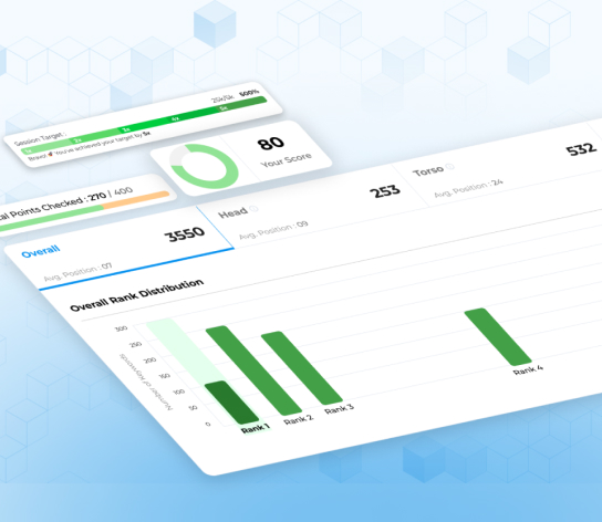
Example of an SEO dashboard in Looker Studio, with scorecards for key metrics (top row) and charts to break down performance by dimension. In this sample, the top cards show total Impressions, Clicks, CTR, and Average Position, while the bar and pie charts visualize clicks by country.
As you add each element, you can drag and arrange them on the canvas to create a logical layout. A common layout is to have a header of scorecards (summarizing key metrics), and below that, one section for traffic over time, another for top queries/pages, etc. Remember to give each chart a clear title (“Clicks Over Time”, “Top 10 Queries by Clicks”, etc.) so viewers know what they’re looking at.
Don’t worry if it takes a bit of tweaking – you can resize charts, adjust their data, or add additional text boxes for explanations. Looker Studio also offers pre-built templates in the Report Gallery, which you can use as a starting point (Leveraging Looker Studio for Enhanced SEO Reporting and Analysis.docx). But building from scratch as we’re doing helps you learn the tool and tailor the dashboard to your exact needs.
5. Tips on Customizing the Report (Filters, Date Range, Branding)
After adding your charts and tables, you’ll likely want to make the report interactive and align it with your branding. Looker Studio provides several features to customize the report’s functionality and appearance:
- Date Range Controls: It’s very useful to add a date range picker to your report. This is an interactive filter where the user can select the time period (e.g., last 7 days, last 28 days, last month, custom range). To add it, click Add a Control → Date Range. Place it at the top of your dashboard. By default, it will apply to all your charts (if you set the charts to use the “Auto Date Range” from the control). This way, you can switch the timeframe of the SEO report easily – for example, comparing this month to last month, or looking at a specific week (Leveraging Looker Studio for Enhanced SEO Reporting and Analysis.docx). It saves you from having to create separate reports for different date ranges.
- Filters and Dropdown Controls: You can also add filter controls to let viewers slice the data. For instance, you might add a drop-down filter for Device (so one could view “Desktop only” or “Mobile only” metrics) or for Country to focus on a specific region (Leveraging Looker Studio for Enhanced SEO Reporting and Analysis.docx). Another example: a filter for Google Analytics “Default Channel Grouping” could let you ensure only “Organic Search” is displayed (though if your data source is already filtered to organic, that’s handled). To add a filter control, click Add a Control and choose Drop-down list (or similar), then set it to the dimension you want to filter by (e.g., Device). Filters empower the viewer to answer specific questions with the same dashboard.
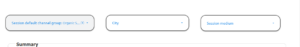
- Report-level vs Chart-level Filters: If you want a filter to apply to all charts in the report (for example, filter everything to only Mobile traffic), you can make it a Report-level filter. In edit mode, select a filter control, and in the Properties panel, set its scope to “Report”. Alternatively, you can apply a fixed filter to a specific chart (for instance, a table showing only USA data). To do that, select the chart, go to the DATA tab in properties, and add a filter condition (e.g., Country = United States). This flexibility in filtering helps customize the view for different needs.
- Branding – Customize Style and Theme: Looker Studio allows extensive formatting to match your brand or style. Under the Theme and Layout settings, you can choose preset color themes or define your own colors and font styles. Try to use your company’s color palette for chart accents and backgrounds. You can also add your logo to the report (use the Add Image option). For example, if your brand color is blue, you might make the header background blue and use that color for chart bars or lines. Consistent fonts and colors give your dashboard a professional look . Don’t go too crazy with colors – sticking to 2-3 main colors (plus neutrals) is a good rule of thumb for clarity
- Customizing Chart Display: You can edit each chart’s style – for instance, turn on data labels (to show numbers on bars/lines), adjust axis ranges, or change a line chart to an area chart if desired. It’s often helpful to enable data labels on scorecards (to show a comparison versus previous period, for example). Looker Studio also lets you add reference lines or goals on charts, but for a beginner-friendly report, that might not be needed immediately.
- Layout Considerations: Arrange the elements in a logical order (e.g., summary at top, details below). Use text boxes to provide context if needed (“Overview”, “Traffic Trend”, etc.). Ensure charts are aligned and spaced neatly – the Snap to Grid feature can help in aligning elements. A well-organized dashboard is easier to read and looks more polished.
By utilizing date controls and filters, your SEO report becomes interactive and flexible for the viewer. And by customizing the style, it becomes uniquely yours – matching your brand and emphasizing what’s important. Take some time to adjust these settings, as they can greatly enhance the usability of your report.
7. Automating and Sharing SEO Reports with Clients or Teams
After building your SEO report, you’ll want to share it with others and possibly automate the delivery so everyone stays updated. Looker Studio makes sharing easy and also allows scheduling email deliveries of the report.
Sharing the Report Online: To share your Looker Studio dashboard with someone (a colleague or client), click the “Share” button at the top of the report. You have options to add people by their Google account email, similar to sharing a Google Doc. Add the email addresses and choose their access level (Viewer can view only; Editor can make changes). Usually, for clients you’ll set them as Viewers. They will then be able to access the live report online and see the latest data anytime.
- Tip: If the data sources are using your credentials (which is default Owner’s credentials), viewers will see the data without needing their own access (. This is useful for client sharing – they see the data you’ve allowed without needing to log into your GA or GSC. Just make sure you’re comfortable with that level of access. If not, you can set data credentials to “Viewer’s credentials”, but then each viewer must have access to the underlying data, which is uncommon for client scenarios.
Scheduling Email Reports: You can set up Looker Studio to email the report PDF on a schedule (e.g., every Monday morning). This is great for automation – the client or team gets the report in their inbox regularly. Here’s how to schedule email delivery:
- Open your report in Looker Studio (Edit mode or View mode).
- Click the drop-down arrow next to the Share button, and select “Schedule email delivery”
- In the schedule settings, add the recipients’ email addresses who should receive the report. You can enter multiple emails, separated by commas
- Choose the frequency and timing: daily, weekly, monthly, etc. For example, you might choose “Every Monday at 9:00 AM” for a weekly SEO report send-out
- Optionally, you can customize the email subject and message, and specify if you want the report as a PDF attachment (commonly yes).
- Save the schedule.
Now, Looker Studio will automatically send out the latest report according to your schedule. This ensures stakeholders see updated SEO metrics without you having to manually pull data or send emails . Always inform recipients that the data is live and updated – so if they click the report link (if you included one), they can explore the interactive version too.
Exporting Reports: If needed, you can also manually export the report as PDF or get an image of a chart. This can be done via the File → Download → PDF (for the whole report) or the context menu on a chart → Download CSV (for the chart’s data). While automation is nice, sometimes you may want a snapshot PDF for a meeting – that’s available anytime.
By sharing and automating, your SEO reporting becomes much more efficient. Clients or team members will appreciate getting regular insights without having to ask for them, and you’ll save time in the long run. Just remember to keep an eye on your reports from time to time to ensure everything is updating correctly (especially if you add new data sources or change something in GA/GSC).
Common Mistakes to Avoid:
- Cluttering the Dashboard: A very common mistake is trying to present too much on one page – dozens of charts, all the metrics available. This can overwhelm viewers. Aim for simplicity and relevance (quality over quantity) (. You can always create additional pages in the report if you need to cover different aspects (e.g., a separate page for “Technical SEO metrics” or “Backlink metrics” if needed).
- Not Filtering Data Sources: Ensure your GA4 charts are filtered to show organic search traffic only (for example, using a filter or segment for Source = “google” and Medium = “organic”). Otherwise, you might mix in all traffic which dilutes the SEO report’s focus. Search Console data is inherently only organic, but GA isn’t – so apply those filters where appropriate.
- Mismatched Date Ranges: Be careful that the date range control or default date range is applied uniformly. If one chart is showing the last 28 days and another accidentally fixed to all time, it can mislead. Using a single date control for the report helps avoid this.
Finally, always double-check your report before sharing it widely. Verify that numbers look correct and charts are pulled from the right sources. Once set up, a Looker Studio SEO report can be an invaluable tool that saves you countless hours and helps you communicate the value of your SEO work clearly.
With this guide, you have the foundation to build a comprehensive SEO dashboard in Looker Studio – from connecting data, choosing metrics, designing visuals, to sharing the final report. Happy reporting, and may your organic traffic grow steadily!
![]()