


Introduction to Cumulative Layout Shift (CLS)
What is Cumulative Layout Shift?
Cumulative Layout Shift, commonly abbreviated as CLS, is a performance metric that captures the amount of unexpected movement of page content during its load time.
When you visit a webpage, elements like images, ads, or fonts may load at different times, causing the content that’s already on the page to move around. If you’ve ever been reading an article online and suddenly the text moves, or you click a link and it shifts out of place, you’ve experienced a layout shift. The CLS score is a way to quantify these experiences to provide a measure of the visual stability of web pages.
Why CLS Matters for Your Website?
Layout shifts can be disruptive to your site visitors, leading to a poor user experience. Imagine trying to tap a button and having it move, causing you to make an unintended action; this is frustrating and could result in visitors leaving your site. A high CLS can also lead to issues like accidentally selecting the wrong item for purchase or missing crucial information because it was displaced. Additionally, the prominence of mobile browsing, with its smaller screen sizes, amplifies the negative effects of CLS, making visual stability even more critical.
Beyond user experience, CLS has SEO implications. As part of its Core Web Vitals, Google considers page stability and performance when ranking sites. A high CLS score could mean lower search rankings and reduced visibility for your site. By addressing CLS, you not only enhance usability but also improve the chances of your site ranking well in search results, which is essential for attracting organic traffic.
Role of CLS in Core Web Vitals and SEO
- CLS is a significant component of the Core Web Vitals, a set of metrics that Google uses to quantify the user experience of web pages.
- These vitals focus on three aspects: loading performance, interactivity, and visual stability, with CLS being the main metric for the latter.
- Since the Core Web Vitals have become a ranking factor in Google’s search algorithm, CLS directly influences how well your site performs in search results.
- A good CLS score is indicative of a stable site that provides a comfortable reading and navigation experience.
- Prioritizing CLS optimization can therefore give you a competitive edge in SEO, potentially leading to better rankings, more organic traffic, and increased engagement.
- Keep in mind that while CLS is crucial, it’s just one piece of the puzzle; it must be balanced with other performance metrics for a holistic approach to SEO.
How to Measure CLS
Key Metrics for CLS Calculation
To calculate CLS, you’ll need to focus on two primary metrics: Impact Fraction and Distance Fraction.
Impact Fraction refers to the visible area of the viewport that is affected by the shift. For instance, if an image loads and pushes down half of the visible content on your screen, the impact fraction would be 0.5.
Distance Fraction measures how much the unstable elements move in the viewport, as a proportion of the viewport’s size. If the same image causes content to shift down by 25% of the viewport’s height, the distance fraction is 0.25.
To determine the CLS, multiply the Impact Fraction by the Distance Fraction. For example, using the numbers given above, the CLS would be 0.5 (Impact Fraction) x 0.25 (Distance Fraction) = 0.125. It’s crucial to analyze all layout shifts that occur during the entire lifespan of the page session to compute the cumulative score.
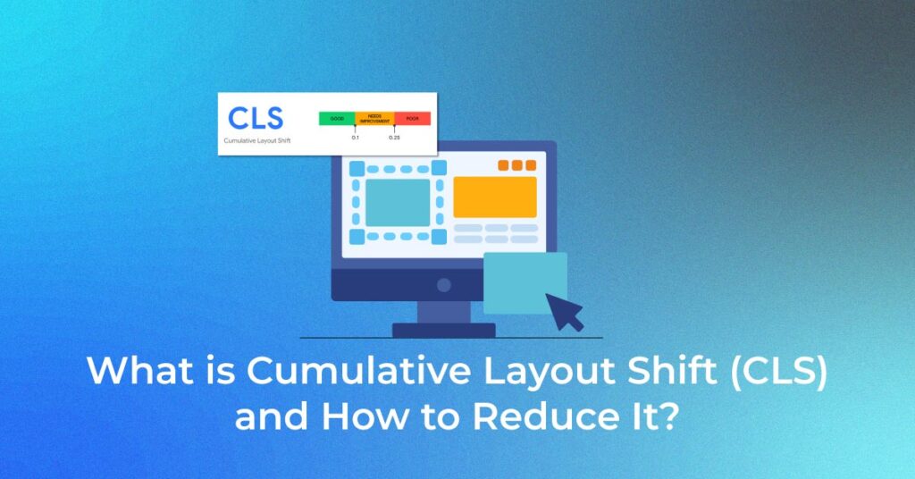
Overview of CLS Thresholds (Good, Needs Improvement, Poor)
Understanding the thresholds for CLS scores is vital for website optimization. Google defines these thresholds as follows:
- Good: A score of 0.1 or less is considered good, indicating that the page provides a stable visual experience.
- Needs Improvement: Scores between 0.1 and 0.25 signify that while the website may not be severely impacting the user experience, there’s room for improvement to achieve optimal stability.
- Poor: If a site’s score exceeds 0.25, it’s labeled as poor, which suggests the page has significant layout shifts that could be detrimental to user experience.
Maintaining a CLS score at or below 0.1 should be the goal for webmasters to ensure a comfortable user experience and avoid penalization in search rankings. This threshold aligns with providing a user experience where content shifts are barely noticeable, if at all.
Tools for Measuring CLS
There are several tools available to help you measure the CLS of your web pages, each providing different insights and benefits:
- Chrome DevTools: A part of the Chrome browser, DevTools enables you to measure CLS in real-time as you interact with the page, allowing for immediate identification of layout shifts.
- Lighthouse: This automated tool is incorporated into Chrome DevTools as well as being available as a standalone application. Lighthouse provides a report with a CLS score based on a simulated load of the page.
- PageSpeed Insights: Leveraging data from the Chrome User Experience Report (CrUX), this tool gives you both lab and field data on your CLS performance and other Core Web Vitals.
- WebPageTest: Known for more detailed and technical insights, WebPageTest offers lab data on a variety of performance metrics, including CLS.
- GTmetrix: This tool presents both lab data and historical performance data, which can be helpful for tracking CLS over time.
- Search Console – Core Web Vitals Report: A part of Google Search Console, this tool provides field data on how your pages perform based on real-world usage data.
Remember that while lab tools are useful for simulating specific conditions and getting immediate feedback, field tools provide a more accurate representation of what your actual users are experiencing.
Identifying Common Culprits of High CLS
1. The Role of Images and Videos
Images and videos are among the most common culprits of high CLS. Unspecified dimensions for these media types can lead to significant layout shifts as they load. When you don’t set explicit width and height attributes, the browser doesn’t allocate the correct space for them until they fully load, by which time they can disrupt the already rendered layout, causing a jarring user experience.
To address this, always specify both width and height attributes for images and videos. This practice allows the browser to reserve the necessary space in the page layout, ensuring content around these media does not shift unexpectedly. If you’re using responsive images and videos, CSS techniques like aspect ratio boxes can help maintain the layout’s stability across different screen sizes.
This approach to handling media files can drastically reduce CLS, contributing to a more visually stable website. It’s also recommended to lazy-load offscreen images and videos to further enhance performance and reduce initial page load times, but always with the correct dimensions to prevent layout shifts.
2. The Impact of Ads, Embeds, and iFrames
Ads, embeds, and iFrames present a unique challenge in maintaining a low CLS. As they often come from third-party sources and may load at various times, they can provoke significant shifts in your web page’s layout if not managed properly.
The key to mitigating CLS issues caused by these elements is to reserve space for them before they load. You can create placeholders with specified dimensions to ensure the surrounding content isn’t affected when the elements do load. For ads, consider using the CSS properties min-height and min-width within ad slots to give a clear expectation of the element’s size.
Another technique is to apply CSS media queries to establish different sizes appropriate for various screen widths. This is particularly effective as it offers a responsive solution that adapts to the user’s device, further minimizing layout shifts. Moreover, historical data can guide the reservation sizes, considering common ad dimensions and qualitative factors that contribute to a better user experience.
When it comes to iFrames and embeds, it’s also critical to define proper sizes, similar to image and video handling, to prevent them from causing layout instability as they load.
3. Dynamically Injected Content
Dynamically injected content can significantly affect CLS if not handled carefully. When content such as banners, forms, or social media feeds is added to a page without user interaction, it can disrupt the user’s experience by causing unexpected layout shifts. This is especially disruptive if the dynamic content is inserted above existing content, pushing it down or to the side.
To manage this and maintain a stable layout, you should:
- Ensure dynamic content has a reserved space so that when it loads, it does not cause shifts in other content.
- Insert new content below the current viewport or in response to a user’s action to minimize the impact.
- Employ strategies such as skeleton screens or placeholders to visually indicate where content will appear without causing a layout shift.
By preemptively managing the space dynamic content will occupy and allowing users to control when it loads, you can significantly diminish its impact on CLS and therefore provide a smoother browsing experience.
Strategies to Reduce CLS
1. Ensuring Proper Image and Video Dimensions
To reduce CLS caused by images and videos, it’s crucial to include width and height attributes directly in the HTML. This helps the browser reserve the appropriate space on the page even before these media files have loaded. As a result, text and other page elements remain in their intended positions, offering a stable and predictable layout for users to interact with.
For responsive design, CSS can be used to scale images and videos proportionally, maintaining their aspect ratio regardless of the screen size. It’s advisable to use the max-width property set to 100% and the height property set to auto for images to ensure they fit their container without causing layout shifts. With videos, wrapping the video in a container with a padding top that corresponds to the aspect ratio can prevent similar issues.
Remember, even when using responsive design, initial dimensions still need to be specified to prevent CLS. Modern development practices, like using CSS aspect ratio boxes, can give images and videos the fluidity needed for responsive design without sacrificing stability.
2. Stabilizing Ad Placement and Dynamic Content
To minimize CLS contributed by ads and dynamic content, consider stabilizing their placement with a few deliberate strategies:
- Reserve space for ads by using placeholders with fixed dimensions that correspond to the most common ad sizes seen on your site. This ensures that when ads load, they fill the designated space without pushing the content around.
- Avoid changing the ad layout during a visitor’s page session. If an ad doesn’t fill the reserved space, it’s better to show some blank space rather than collapse the ad container, which would shift content and increase CLS.
- Implement ‘lazy loading’ for ads and dynamic content that are not in the initial viewport. This means they will only load when you’re likely to see them (for example, as you scroll down the page), which reduces the likelihood of a layout shift.
- Use the loading=”lazy” attribute for dynamic content like embeds and iframes to reduce the impact on CLS and page load time.
- Style dynamic content conservatively, anticipating the space it will occupy and ensuring that any injected content adheres to these size constraints.
Following these practices can significantly enhance your site’s visual stability, creating a more pleasant browsing experience for your users and improving your CLS score.
3. Optimizing Web Fonts
Optimizing web fonts is a critical step in reducing CLS. Web fonts can greatly enhance the visual appeal of your site, but if they load after the page content, they can cause a layout shift, impacting your CLS score negatively. Here’s how you can optimize web fonts to improve CLS:
- Preload your key web fonts to inform the browser that these files are important and should be loaded early in the page loading process. Use the link rel=”preload” tag in your HTML to prioritize these resources.
- Employ the font-display CSS property and set it to optional. This setting favors text visibility during font loading and prevents layout shifts. If the web font doesn’t load fast enough, the browser will use a fallback font, minimizing the effect on the page layout.
- Choose fallback fonts that closely resemble the web font in size, line height, and character width. This lessens the visual difference when a fallback font is used and prevents the content from shifting.
- Limit the number of font styles and weights used on your site as each one requires a separate file to be loaded, which can contribute to layout shifts.
- Consider utilizing the Font Loading API for finer control over font loading behaviors, allowing you to load fonts in a way that minimizes their impact on the layout.
Taking these steps can significantly reduce the risk of layout shifts caused by web fonts, leading to a lower CLS and a more seamless user experience.
4. Predefining Space for Dynamic Content
To avoid layout shifts caused by dynamic content, it’s good practice to pre-allocate space on your web pages. Whether it’s for ads, product recommendations, or social media feeds, having a predetermined space ensures that once the content loads, it doesn’t push or shuffle other elements on the page, thus maintaining stability and contributing to a lower CLS.
Follow these steps to predefine space effectively:
- Set explicit dimensions for containers that will host dynamic content. Define the width and height in your markup or CSS, so that when content loads, it fits neatly into the space without causing reflows or repaints.
- Use placeholders or skeleton screens to hold the space. This could be a simple div with a background color or a wireframe that matches the dimensions of the expected content. It signals to users that content is forthcoming without causing disruptive shifts.
- For content that is dynamically sized or can’t have a fixed aspect ratio, consider using intrinsic ratios to lock the space. With a combination of padding and before pseudo-element, you can set a percentage-based padding to maintain the aspect ratio of the content container.
- Take advantage of CSS’s min-height or min-width properties to ensure that the space allocated never goes below a certain size, even if no content or less content than expected is delivered.
- If the content size may vary (different ad sizes, for instance), use media queries to manage different layout possibilities, ensuring proper space is reserved for each scenario depending on the screen size.
Implementing these strategies enhances your webpage’s visual stability and contributes to a better user experience while navigating your site.
Measuring and Monitoring CLS
Lab Tools vs Field Tools for CLS Measurement
Understanding the difference between lab and field tools for measuring CLS is crucial for a comprehensive performance analysis.
- Lab Tools simulate a controlled environment where you can conduct tests, making them ideal for debugging during development. They help you catch potential CLS issues before they affect real users. However, they can only measure layout shifts that occur during page load and might not capture shifts that users experience in the field.
- Field Tools, on the other hand, collect data from actual user interactions with your site, providing a real-world picture of your site’s performance. This data is invaluable for understanding the varying conditions under which users visit your site, such as device types, network conditions, and browser capabilities, all of which can affect CLS.
While lab data is helpful for initial testing and finding obvious layout shift issues, field data is essential for optimizing your site based on real user experiences. Together, these tools provide a complete view of your site’s performance, helping you prioritize fixes that will provide the most significant benefit to your users.
How to Improve Your CLS Score with Real User Monitoring
Improving your CLS score with Real User Monitoring (RUM) involves collecting data on how your website performs for actual visitors. It captures a more accurate picture of layout shifts occurring in the wild and hints at where improvements are needed. Here’s how you can use RUM to your advantage:
- Implement a RUM tool that tracks layout stability metrics, such as Google’s Chrome User Experience Report (CrUX) or third-party services that capture similar data.
- Analyze the data to identify patterns in layout shifts. Determine when and where users are experiencing the most significant issues, whether it’s on mobile or desktop, on certain browsers, or in specific regions.
- Segment the data based on different variables, such as the type of devices, connection speeds, or user demographics, to pinpoint more precisely which factors affect your CLS.
- Test and optimize based on your findings. If a particular page or element consistently contributes to a high CLS, take corrective action. This could mean reserving space for dynamic content, optimizing image loading, or addressing any third-party scripts that might cause layout changes.
- Monitor continuously as CLS is dynamic and changes as you make updates to your site. Regularly analyze RUM data to ensure that the user experience remains stable over time, especially after deploying new features or content.
By integrating RUM into your performance strategy, you make data-driven decisions that can significantly enhance your site’s user experience and, consequently, your CLS score.
The SEO Connection
The Importance of CLS in Google’s Core Web Vitals
Google’s Core Web Vitals are a set of specific factors that Google considers important in a webpage’s overall user experience. CLS is a vital component of these metrics, specifically measuring visual stability. Its importance lies in the fact that it directly impacts how users perceive the smoothness and usability of a site. When Google evaluates your site’s performance, a low (better) CLS score helps to convey that your site is user-friendly and stable, which Google favors in its ranking algorithm.
Focusing on CLS is not just about avoiding penalties in search rankings, but also about providing an excellent user experience. By optimizing for CLS and adhering to the thresholds set by Google’s guidelines, you can ensure that users have a pleasant experience on your site, which can lead to increased engagement and conversion rates.
How Reducing CLS Can Boost Search Engine Rankings
Reducing CLS can give your website a competitive edge in search engine rankings. Google’s inclusion of CLS within Core Web Vitals reflects the search giant’s commitment to enhancing the web user experience, and by extension, rewarding sites that meet these standards. Lower CLS scores signify a stable and reliable website, leading to enhanced user satisfaction. This positive user experience translates into higher engagement metrics, such as more time on site and lower bounce rates, which are key signals used by search engines for ranking websites.
Moreover, optimizing for CLS and other performance metrics sends a signal to Google that your site offers a superior user experience, potentially resulting in higher visibility in search results. As you work to reduce CLS and improve other Core Web Vitals, you may see a corresponding improvement in your site’s search performance, driving more organic traffic and, ultimately, contributing to your site’s success.
FAQ
What is a Good CLS Score?
A good CLS score is 0.1 or lower. Google categorizes this score range as ‘Good,’ meaning it meets the ideal threshold for visual stability in the Core Web Vitals assessment. A CLS within this bracket is pivotal for optimal user experience and can favorably influence your website’s SEO rankings.
Can Changes in My Content Increase CLS?
Yes, changes in your content can increase CLS, especially if you add, remove, or alter content without considering the impact on layout stability. Adding large elements like images or ads without reserving space, or dynamically injecting content above existing elements, can cause other content to shift, leading to a high CLS.
Are There Tools to Help Identify CLS Issues?
Certainly, there are several tools available to help you identify CLS issues on your website. Google’s Lighthouse and PageSpeed Insights provide detailed reports on CLS and other performance metrics. Chrome DevTools offers real-time insight into layout shifts. For ongoing monitoring, Search Console’s Core Web Vitals report can track field data, and WebPageTest allows for customized testing across different browsers and devices.
How Often Should I Check My Website’s CLS?
It’s wise to check your website’s CLS regularly, ideally as part of your ongoing site performance monitoring routine. After updates or releases, re-evaluate to catch any regressions. At a minimum, perform a comprehensive CLS assessment with each significant design change, new feature addition, or every couple of months to ensure consistent user experience quality.
Is CLS the only metric for page stability?
No, CLS isn’t the only metric for page stability, but it’s the primary one used by Google in its Core Web Vitals to measure visual stability. Other metrics that can influence page stability include Frame Rate and Time to Interactive.